


Customer journey maps often become static artifacts that sit on a shelf or gather digital dust. They are created during workshops and then filed away, failing to influence daily operations. The core issue is rarely the data itself, but rather the layout chosen to present it. An actionable journey map layout is not just a visual representation of a customer’s path; it is a strategic tool designed for collaboration, problem-solving, and continuous improvement.
When teams struggle to execute on insights, the fault often lies in how those insights are structured. A robust layout forces clarity. It highlights friction points without ambiguity and assigns ownership to specific improvements. This guide explores how to construct journey map layouts that drive tangible change across your organization.
Why Layout Determines Impact 🎯
The physical or digital arrangement of a journey map dictates how stakeholders interact with the information. If the layout is cluttered, the signal is lost in the noise. If the layout is too abstract, it fails to connect with operational realities. Here is why the structural design matters:
- Facilitates Alignment: A clear layout ensures that marketing, sales, and support teams are looking at the same data points in the same way.
- Prioritizes Effort: Visual hierarchy directs attention to the most critical pain points first.
- Enables Measurement: Specific columns for metrics allow teams to track progress over time.
- Supports Iteration: A flexible layout accommodates updates as customer behaviors shift.
Without a deliberate layout strategy, journey mapping becomes an exercise in art rather than an exercise in strategy. The goal is to move from “showing” the journey to “using” the journey.
Core Components of an Actionable Layout 🧩
To build a layout that works for teams, you must include specific sections that bridge the gap between observation and action. A standard linear flow is often insufficient. Consider integrating the following elements into your grid structure.
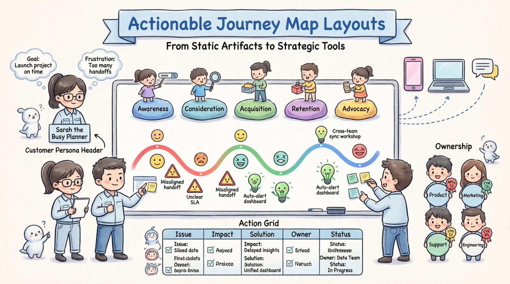
1. The Customer Persona Header
Every map must anchor itself to a specific user type. Place this at the top of the layout. Include:
- Name and role (e.g., “Sarah, the Busy Planner”)
- Key motivations and goals
- Current frustrations
- Demographic context
2. The Journey Phases
Divide the horizontal axis into distinct stages. Avoid vague labels. Use action-oriented terms.
- Awareness: How they find you.
- Consideration: How they evaluate options.
- Acquisition: The moment of purchase or signup.
- Retention: Ongoing usage and engagement.
- Advocacy: Referrals and feedback.
3. Touchpoints and Channels
Map the specific interactions within each phase. This requires precision. A touchpoint is not just “website”; it is “Product Comparison Page Load Speed”.
4. Emotional Curve
Include a visual line or bar chart indicating sentiment across the journey. This highlights where customers feel frustrated or delighted. Use color coding for immediate recognition.
5. Pain Points and Opportunities
This is the most critical section for actionability. Each pain point must have a corresponding opportunity or solution idea attached to it. Do not leave these disconnected.
6. Ownership and Metrics
Assign an owner to each improvement opportunity. Define the metric used to measure success. This transforms the map from a passive document into an active task list.
Designing for Collaboration and Stakeholders 🤝
Teams function differently. A layout that works for product designers might not work for executive leadership. You may need a multi-layered approach to your layout design.
Layer 1: The Strategic Overview
This version is for leadership. It focuses on high-level stages, major touchpoints, and overall sentiment trends. It omits granular details to maintain clarity.
Layer 2: The Operational Detail
This version is for front-line teams. It includes specific script variations, button labels, and technical constraints. It is the reference for daily execution.
Layer 3: The Feedback Loop
This section allows stakeholders to add notes or flag changes. It should be accessible to anyone who interacts with the customer data regularly.
Visual Hierarchy and Flow 🎨
Even without CSS styling, the arrangement of text and elements creates hierarchy. Use spacing and alignment to guide the eye.
- Left-to-Right Flow: Follow the chronological order of the journey. This matches the natural reading pattern.
- Vertical Grouping: Group related information vertically. For example, keep all data about the “Checkout” phase in one vertical column.
- Whitespace Usage: Do not crowd the map. Whitespace allows the reader to focus on the content without visual fatigue.
- Consistent Icons: Use specific icons for different channels (e.g., email, phone, chat). This speeds up information processing.
Consider the color palette. Use red for friction points and green for positive moments. This creates an immediate emotional response to the data.
Turning Insight into Action 🛠️
The defining feature of an actionable layout is the inclusion of a dedicated “Action Plan” section. Without this, insights remain theoretical. Here is how to structure that section within your layout.
The Action Grid
Create a specific area at the bottom or side of the map where improvements are tracked. Columns should include:
- Issue: The specific pain point identified.
- Impact: High, Medium, or Low priority.
- Proposed Solution: A brief description of the fix.
- Owner: The individual responsible.
- Status: Not Started, In Progress, Completed.
Connecting to Existing Workflows
Ensure the layout references existing project management systems. If a team member is assigned a task on the map, they should be able to see where that task lives in your internal system. This prevents the map from becoming a siloed document.
Common Pitfalls in Layout Design ⚠️
Avoid these structural mistakes to ensure your map remains useful over time.
| Common Mistake | Why It Fails | Corrective Action |
|---|---|---|
| Overcrowding | Too much text prevents quick scanning. | Summarize key points. Use bullet lists. |
| Generic Personas | Maps that apply to everyone apply to no one. | Create specific layouts for distinct user types. |
| Static Phases | Journeys change. Fixed phases become obsolete. | Use modular sections that can be swapped or added. |
| Missing Metrics | No way to measure if changes help. | Define KPIs for every major touchpoint. |
| No Ownership | Everyone is responsible, so no one is. | Assign specific names or roles to every action item. |
| Complex Navigation | Hard to find specific information. | Use clear headers and index links. |
Maintaining the Map Over Time 🔄
A journey map is a living document. The layout must support updates without requiring a complete redesign. This means using consistent formatting for new data.
Review Cadence
Schedule regular reviews of the map. Quarterly reviews are standard for most organizations. During these sessions, validate the current layout against new data.
Data Validation
Ensure the information on the map reflects reality. Conduct interviews or analyze support tickets to verify the pain points listed. If a pain point is no longer relevant, remove it from the layout to reduce clutter.
Version Control
Keep track of changes. If a layout is significantly altered, document the reason. This helps teams understand the evolution of their strategy.
Measuring the Success of Your Layout 📊
How do you know if your layout is working? Look for specific behavioral changes within the team.
- Increased Participation: More team members reference the map in meetings.
- Faster Decision Making: Decisions regarding customer experience are made quicker because the data is clear.
- Reduced Redundancy: Teams stop solving the same problems repeatedly.
- Higher Customer Satisfaction: Ultimately, the layout should correlate with improved NPS or CSAT scores.
Track these metrics alongside the journey map updates. This proves the value of the structural design.
Final Thoughts on Implementation 💡
Creating an actionable journey map layout is a discipline that requires attention to detail and a commitment to clarity. It is not about making things look pretty; it is about making things work. By focusing on the components, hierarchy, and actionability of the layout, teams can transform a simple map into a powerful engine for customer experience improvement.
Start by auditing your current maps. Do they have clear owners? Are the phases accurate? Is there space for action items? Adjust the layout to answer these questions. When the structure supports the strategy, the results follow.
Remember that the best layout is one that is used. If your team avoids the map because it is hard to read, the data inside is useless. Prioritize readability and utility above all else. Continuous refinement ensures the map remains relevant as your customers and business evolve.

