


Customer journey mapping has evolved from simple sketches to complex, data-driven visualizations. However, the most common failure point in this process is the reliance on a single type of information. A map built solely on numbers lacks empathy. A map built solely on stories lacks scale. To create a truly accurate representation of the customer experience, teams must balance qualitative and quantitative data in journey maps. This integration provides a holistic view of behavior and motivation.
When these two data streams converge, the resulting insight is robust. Numbers reveal what is happening across thousands of interactions. Stories reveal why those actions occur. Ignoring either side leads to gaps in understanding, misaligned strategies, and ultimately, customer friction. This guide details how to synthesize these distinct data types into a coherent narrative without losing the nuance of either.
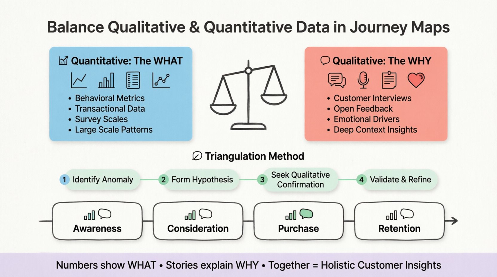
🧩 The Two Sides of Customer Insight
To balance these data types effectively, one must first understand their distinct roles and limitations. They are not competitors; they are complementary tools in the same toolkit.
📈 Quantitative Data: The What
Quantitative data is numerical. It is objective and measurable. In the context of a customer journey, this data comes from system logs, transaction records, and survey scales. It answers questions regarding volume, frequency, and efficiency.
- Behavioral Metrics: Click-through rates, session duration, cart abandonment rates, and page views.
- Transactional Metrics: Average order value, purchase frequency, and customer lifetime value.
- Survey Scales: Net Promoter Score (NPS), Customer Satisfaction (CSAT), and Customer Effort Score (CES).
The strength of quantitative data lies in its ability to identify patterns across a large population. If 40% of users drop off at a specific step, that is a quantifiable signal of a problem. However, the number itself does not explain the friction. It does not tell you if the button is too small, the text is confusing, or the pricing is unexpected. It only tells you that a barrier exists.
🗣️ Qualitative Data: The Why
Qualitative data is descriptive. It is subjective and experiential. This data comes from interviews, open-ended survey responses, support ticket logs, and social media comments. It answers questions regarding emotion, motivation, and perception.
- Direct Feedback: Customer interviews, focus groups, and usability testing notes.
- Unstructured Text: Chat logs, email correspondence, and review comments.
- Observational Notes: Field studies where researchers watch customers interact with a product or service.
The strength of qualitative data is depth. It uncovers the emotional drivers behind a decision. It explains why a user hesitated or why a specific feature caused frustration. However, it lacks scale. A handful of interviews might reveal a painful issue, but they cannot confirm if that issue affects 10% or 10% of the user base.
⚠️ Why Imbalance Leads to Flawed Maps
When journey maps lean too heavily in one direction, they become distorted. Understanding these distortions helps teams maintain equilibrium during the mapping process.
🔢 The Trap of Pure Quantification
Maps created exclusively from analytics data often look like flowcharts. They show touchpoints and conversion rates but lack human context. This approach assumes that behavior is rational and consistent.
- Loss of Emotion: A high drop-off rate is recorded, but the frustration level is unknown.
- Context Blindness: Analytics might show a spike in support calls, but without qualitative input, the team might not know if it is due to a bug or a marketing promise that was not kept.
- Optimization for Efficiency over Satisfaction: Teams might streamline a process to reduce steps, inadvertently removing features that users actually valued for peace of mind.
💬 The Trap of Pure Qualification
Maps built only from interviews and anecdotes are often anecdotal. They reflect the experiences of a specific, vocal subset of users rather than the broader population.
- Survivorship Bias: Interviews often attract users who are either very satisfied or very angry. The quiet majority is missing.
- Sample Size Issues: Five interviews do not represent fifty thousand users. Priorities might shift based on the specific individuals interviewed.
- Lack of Benchmarking: Without numbers, it is impossible to track progress over time. You know the user is unhappy, but you cannot measure if the fix actually reduced the dissatisfaction.
🔗 Integrating Data Streams
Integration is not about merging data into a single spreadsheet. It is about weaving the narrative together so that the numbers validate the stories, and the stories humanize the numbers. Below is a framework for aligning these inputs.
📋 Comparison of Data Types
| Feature | Quantitative Data | Qualitative Data |
|---|---|---|
| Primary Question | How much? How many? | Why? How? |
| Format | Numbers, Charts, Graphs | Text, Audio, Video, Quotes |
| Scope | Large sample sizes | Small, deep sample sizes |
| Strength | Identifies trends and patterns | Identifies motivations and emotions |
| Weakness | Lacks context and nuance | Lacks statistical significance |
| Best Use | Validating hypotheses at scale | Generating hypotheses and exploring feelings |
🛠️ The Triangulation Method
To balance the data, use a triangulation approach. This means gathering evidence from multiple angles to confirm a finding.
- Identify the Anomaly: Use quantitative data to find a statistical outlier. For example, a 50% drop-off on the checkout page.
- Formulate a Hypothesis: Based on the number, propose a reason. Perhaps the form is too long or the shipping cost is hidden.
- Seek Qualitative Confirmation: Conduct user interviews or review support tickets related to that specific checkout step.
- Validate or Refine: If users confirm the shipping cost was unexpected, the hypothesis is validated. If they say nothing about shipping, the hypothesis is wrong, and the quantitative data might be misleading (e.g., maybe the payment gateway crashed).
🗺️ Mapping Stages with Dual Data
A customer journey is rarely linear. It consists of multiple stages, from awareness to retention. Each stage requires a different weighting of data types to be effective.
👀 Awareness and Discovery
In this stage, the volume of traffic is high, but the intent is variable.
- Quantitative: Traffic sources, bounce rates, and time on landing pages.
- Qualitative: Search intent analysis, social sentiment, and first-impression feedback.
- Integration: Use analytics to see which channels drive traffic. Use interviews to understand what message resonated with the users who actually converted versus those who bounced.
🤔 Consideration and Evaluation
Here, users compare options. Friction is often subtle.
- Quantitative: Product page views, time spent on pricing, comparison tool usage.
- Qualitative: FAQ interactions, customer support queries during research, competitor reviews.
- Integration: High traffic on pricing pages indicates interest. Qualitative feedback reveals if the pricing structure is confusing or if the value proposition is unclear.
💳 Purchase and Transaction
This is the critical conversion point where drop-offs are costly.
- Quantitative: Conversion rate, cart abandonment rate, error rates in forms.
- Qualitative: Usability testing recordings, frustration signals during checkout, trust indicators.
- Integration: If the error rate is low but abandonment is high, qualitative data might reveal that users are hesitant due to trust issues rather than technical errors.
🤝 Post-Purchase and Retention
This stage determines long-term loyalty.
- Quantitative: Repeat purchase rate, churn rate, renewal dates.
- Qualitative: Customer support sentiment, review sentiment, net promoter scores.
- Integration: High churn numbers need to be paired with exit interview data to understand if the product failed to deliver on promises.
🕳️ Avoiding Common Analytical Traps
Even with good intentions, teams can introduce bias when combining data. Being aware of these pitfalls ensures the integrity of the journey map.
🚫 Confirmation Bias
Teams often look for data that supports their existing beliefs. If leadership believes a feature is popular, they might prioritize quantitative usage stats while ignoring qualitative feedback that the feature is confusing. Conversely, if a team hates a process, they might cherry-pick negative interviews while ignoring positive usage data.
- Mitigation: Assign a neutral reviewer to analyze the data before the journey map is drafted. Ensure both positive and negative data points are represented.
🚫 The “Vocal Minority” Trap
Qualitative data often comes from users who take the time to speak up. These users are often outliers. Relying too heavily on them skews the map.
- Mitigation: Always cross-reference qualitative quotes with quantitative frequency. Does one user’s complaint represent a trend seen in the analytics?
🚫 Data Silos
Marketing teams hold one set of data, support teams hold another, and product teams hold a third. When these silos are not broken down, the journey map becomes fragmented.
- Mitigation: Establish a central repository or data governance policy. Ensure all stakeholders have access to the same raw data sources before mapping begins.
🚀 Moving Forward with Integrated Insights
The goal of balancing data is not perfection. It is progress. A journey map is a living document. It requires continuous updates as new data becomes available.
🔄 Building a Sustainable Feedback Loop
To keep the balance maintained, embed the process into regular operations.
- Quarterly Data Audits: Review the journey map every quarter. Are the quantitative metrics shifting? Has new qualitative feedback emerged that contradicts previous assumptions?
- Stakeholder Workshops: Bring product, marketing, and support teams together to review the map. Different departments see different data points. Their combined perspective validates the dual approach.
- Real-Time Alerts: Set up automated alerts for significant quantitative shifts. When a metric spikes, trigger a qualitative investigation to understand the cause immediately.
📊 Measuring the Map’s Impact
How do you know if the balanced map is working? You measure the outcomes of the decisions made based on the map.
- Reduced Friction: Did the drop-off rates decrease after addressing the friction points identified by the data?
- Improved Sentiment: Did NPS or CSAT scores improve after addressing the emotional pain points found in interviews?
- Faster Decision Making: Did the team spend less time debating “what is happening” and more time deciding “what to do”?
🛡️ Ensuring Data Quality
Garbage in, garbage out applies doubly when balancing data types. Poor data quality in either stream undermines the entire exercise.
🔍 Cleaning Quantitative Inputs
Ensure tracking is accurate. If pixels are missing or tracking codes are broken, the numbers are lies. Validate that the data reflects real user behavior and not bot traffic or internal testing.
🗣️ Cleaning Qualitative Inputs
Ensure interviews are not leading. Avoid questions that suggest an answer. When analyzing open-ended responses, use consistent coding frameworks so that themes are identified objectively.
🎯 Summary of Best Practices
Creating a journey map that respects both data types requires discipline. It demands that teams value the story as much as the statistic. Here is a checklist to ensure alignment.
- Define the Goal: Are you mapping for efficiency or empathy? Adjust the data ratio accordingly.
- Start with Quant: Use numbers to find the problem areas that need investigation.
- Follow with Qual: Use stories to understand the root cause of the problem areas.
- Validate Continuously: Treat the map as a hypothesis, not a fact. Update it as new data arrives.
- Visualize Clearly: Use the map to show where numbers and stories intersect. Do not hide the conflict between the two; highlight it as an area for discovery.
When done correctly, the journey map becomes a single source of truth. It bridges the gap between the boardroom and the front lines. It connects the analytics dashboard with the customer service desk. By balancing qualitative and quantitative data in journey maps, organizations can build experiences that are not only efficient but also genuinely understood.

