Customer journey mapping is a powerful exercise, but it often begins as a hypothesis rather than a fact. Teams construct these maps based on stakeholder interviews, customer feedback, and internal logic. While these inputs are valuable, they frequently suffer from the planning fallacy. The perceived path a customer takes rarely matches the actual path taken in the digital ecosystem. Without validation, a journey map risks becoming a decorative artifact rather than a strategic asset.
This guide provides a rigorous framework for validating journey map assumptions using analytics data. By grounding your maps in behavioral evidence, you transform static diagrams into dynamic tools that drive decision-making. We will explore how to identify key assumptions, select the right data sources, and interpret metrics to confirm or refute your hypotheses.
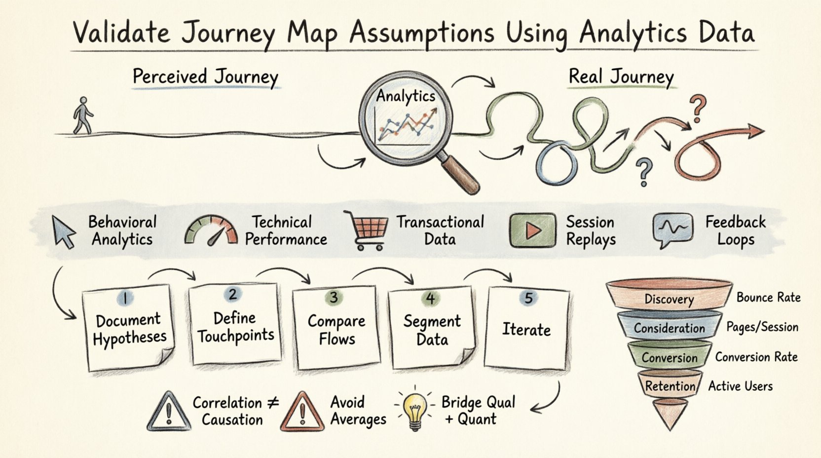
🕵️♂️ The Gap Between Perception and Reality
Assumptions in journey mapping typically stem from internal biases. Product managers might believe users want to compare features before purchasing, while sales teams assume users need immediate human support. Analytics data cuts through this noise. It reveals what customers actually do, not what they say they do.
- The Ideal vs. The Real: Internal maps often show a linear progression. Real-world data shows loops, backtracking, and abandoned paths.
- The Invisible Friction: Users may complain about a specific step, yet analytics might show they bypass it entirely. This highlights a disconnect between reported pain points and actual behavior.
- The Missing Context: Interviews capture intent, but analytics capture execution. A user might intend to buy a product, but analytics show they drop off at the checkout button due to a technical error.
Validating your map is not about proving your initial idea wrong. It is about refining the narrative to align with observable reality. This process reduces risk and ensures resources are allocated to areas that actually impact the customer experience.
📥 Essential Data Sources for Validation
To validate a journey, you need a holistic view of user behavior. Relying on a single metric, such as page views, provides an incomplete picture. You must aggregate data from multiple sources to triangulate the truth.
| Data Source Type | What It Reveals | Validation Use Case |
|---|---|---|
| Behavioral Analytics | Clicks, scrolls, navigation paths, time spent | Confirms the order of steps and identifies drop-off points. |
| Technical Performance | Page load times, error rates, device compatibility | Explains why users abandon a specific stage due to friction. |
| Transactional Data | Order values, frequency, repeat purchases, refund rates | Validates the value exchange at the conversion stage. |
| Session Replays | Mouse movements, rage clicks, form interactions | Provides qualitative context to quantitative drop-offs. |
| Feedback Loops | Survey responses, NPS scores, support tickets | Correlates emotional sentiment with behavioral actions. |
Integrating these sources allows you to see the full story. For instance, if a user abandons a form, behavioral data shows the drop-off, technical data might reveal slow load times, and session replays could show the user struggling with a specific field.
🛠️ Step-by-Step Validation Framework
Validating assumptions requires a structured approach. You cannot simply look at a dashboard and expect clarity. Follow this systematic process to ensure accuracy.
1. Document Your Hypotheses
Before accessing data, explicitly list the assumptions embedded in your current journey map. Write them down clearly. This creates a benchmark for comparison.
- Assumption A: Users read the pricing page before creating an account.
- Assumption B: Mobile users prefer a simplified checkout flow.
- Assumption C: Customers return to the support page after purchase.
Documenting these prevents confirmation bias later. You might be tempted to ignore data that contradicts your map. Explicit documentation forces accountability.
2. Define Key Touchpoints
Map your journey stages to specific events in your analytics platform. A “stage” in a map is abstract; an “event” is concrete.
- Awareness: Landing page views, referral sources.
- Consideration: Product page views, feature comparisons, content downloads.
- Purchase: Add to cart, initiate checkout, payment success.
- Retention: Login frequency, feature usage, subscription renewals.
Ensure your event tracking is configured correctly. If an event is missing, your validation is impossible. Clean data is the foundation of valid insights.
3. Compare Actual Flows to Expected Flows
Use funnel analysis to compare the expected conversion path against the actual path. Look for deviations.
- Linear vs. Non-Linear: Does the data show users jumping between pages out of order?
- Side Paths: Do users visit the blog or FAQ before the pricing page?
- Drop-offs: Where does the funnel break? Is it at the step you predicted or a different one?
If your map shows a straight line from Awareness to Purchase, but the data shows a 40% drop at the Consideration stage, you have found a critical validation point.
4. Segment Your Data
Aggregated data can hide significant variations. A journey map that works for one user segment may fail for another. Segment your analysis by:
- Device: Mobile, Desktop, Tablet.
- Traffic Source: Organic search, paid ads, social media, direct.
- User Type: New visitors, returning customers, logged-in users.
- Geography: Region-specific behaviors or payment preferences.
A desktop user might convert quickly, while a mobile user might require more educational content before purchasing. Segmentation reveals these nuances.
5. Iterate and Update
Validation is not a one-time event. Update your journey map whenever you detect significant shifts in behavior. Set a schedule to review key metrics quarterly.
📈 Key Metrics to Track
Not all metrics are created equal. Vanity metrics like total page views do not help validate specific journey stages. Focus on metrics that indicate movement through the map.
| Stage | Primary Metric | Secondary Metric | Interpretation |
|---|---|---|---|
| Discovery | Bounce Rate | Avg. Time on Page | High bounce suggests the entry point does not match user intent. |
| Consideration | Pages per Session | Return Visits | Low pages per session may indicate users find what they need too quickly or leave due to lack of info. |
| Conversion | Funnel Conversion Rate | Cart Abandonment Rate | High abandonment indicates friction in the payment or sign-up process. |
| Retention | Active User Rate | Feature Adoption Rate | Low adoption suggests the product value is not being realized after sign-up. |
When analyzing these metrics, look for trends over time. A sudden spike in bounce rate might indicate a broken link or a change in marketing messaging. A gradual decline in conversion rate might signal growing competition or market fatigue.
⚠️ Common Data Interpretation Errors
Even with the right data, interpretation errors can lead to incorrect conclusions about your journey map. Avoid these common pitfalls.
- Confusing Correlation with Causation: Just because two events happen together does not mean one caused the other. Users might visit the FAQ page because they are confused, not because they are interested in the content.
- Ignoring Negative Data: It is tempting to focus on success stories. However, the users who dropped off are often more valuable to study than those who converted. They reveal where the journey breaks.
- Over-reliance on Averages: An average session duration of 5 minutes might hide two groups: 1-minute scrollers and 10-minute deep readers. Use percentiles (25th, 75th) to understand distribution.
- Attribution Bias: Don’t assume the last touchpoint gets all the credit. Users might interact with email, then social, then search before converting. Understand the multi-touch influence.
- Siloed Data: Viewing web analytics separately from CRM data creates blind spots. A user might browse anonymously online but identify themselves in a sales call. Merge these datasets where possible.
🔗 Bridging Qualitative and Quantitative Insights
Analytics data tells you what is happening. It does not always explain why. To fully validate your assumptions, you must combine quantitative data with qualitative research.
1. Use Session Recordings
When analytics show a drop-off, watch session recordings of users at that point. You might see them struggling with a confusing label, misinterpreting an icon, or simply clicking the wrong button. This visual evidence validates the assumption that the UI is causing friction.
2. Conduct Exit Surveys
Deploy brief surveys to users leaving a critical page. Ask one question: “What stopped you from proceeding?” This directly tests the assumption that price is the barrier, or perhaps the lack of a specific feature.
3. Analyze Support Tickets
Review support logs for keywords related to journey stages. If users frequently ask “How do I reset my password” immediately after account creation, your assumption about a seamless onboarding journey is invalid.
4. Synthesize the Findings
Create a report that links the data point to the user sentiment. For example: “40% of users drop off at the pricing page (Quantitative). Session replays show users struggling to toggle between billing plans (Qualitative). Exit surveys indicate confusion over currency conversion (Qualitative).” This triangulation provides a robust validation of the journey assumption.
🔄 Sustaining an Accurate Map
A journey map is a living document. Once validated, it requires maintenance to stay relevant. Market conditions change, new features launch, and user behaviors evolve. An outdated map is worse than no map at all, as it leads to strategic decisions based on false premises.
1. Establish a Review Cycle
Schedule formal reviews of your journey maps. A quarterly cadence is often sufficient for mature products. During these reviews, update the map based on the latest analytics data. Remove steps that no longer exist and add new ones where behavior has shifted.
2. Monitor for Anomalies
Set up alerts for significant changes in key metrics. A 20% drop in conversion rate overnight is a signal to investigate immediately. Do not wait for the quarterly review to address critical failures.
3. Train Stakeholders
Ensure that everyone who uses the journey map understands the data behind it. When marketing, product, and support teams see the evidence, they are less likely to argue from personal opinion and more likely to collaborate based on facts.
4. Validate Continuously
Treat every product update as a chance to validate the journey. If you change the navigation menu, check if the drop-off points shift. If you change the pricing model, analyze the conversion funnel again. Continuous validation ensures the map remains a true reflection of the customer experience.
💡 Final Considerations
Validating journey map assumptions using analytics data is a discipline that requires patience and precision. It moves the conversation from “I think users do this” to “The data shows users do this.” By rigorously testing your hypotheses, you build a foundation of trust in your strategic planning.
Remember that validation is not about perfection. It is about progress. Your map will never be 100% accurate at all times, but it can be accurate enough to guide meaningful improvements. Focus on the biggest deviations first. Address the highest friction points. Prioritize the changes that impact the most users.
As you implement this framework, you will find that your team becomes more data-literate and less reliant on intuition. This shift in mindset is the true value of the exercise. It empowers you to build experiences that are not just well-designed, but well-verified.
Start by auditing your current journey map. Identify the top three assumptions that feel the least certain. Locate the data sources that can test them. Begin the validation process today. The insights you uncover will shape the future of your product and service delivery.

