


📌 Introduction to Enterprise Architecture Visuals
In the modern business landscape, complexity is the only constant. Organizations are constantly evolving, changing processes, implementing new technologies, and adjusting to market shifts. To manage this complexity, companies often turn to frameworks that help visualize their structure and strategy. One such framework is ArchiMate. While often associated with technical teams, its notation is designed to bridge the gap between business strategy and IT execution.
For non-technical stakeholders, the terminology can seem daunting. However, at its core, ArchiMate notation is simply a language of shapes and lines used to tell a story about how an organization works. It is about clarity, alignment, and communication. This guide aims to demystify the notation, focusing on the visual elements that drive decision-making without requiring a background in software engineering.
Whether you are a business analyst, a project manager, or a senior executive, understanding these diagrams allows you to see the big picture. You can identify where value is created, where bottlenecks exist, and how changes in one area ripple through the rest of the organization.
🧩 The Core Philosophy: Layers and Domains
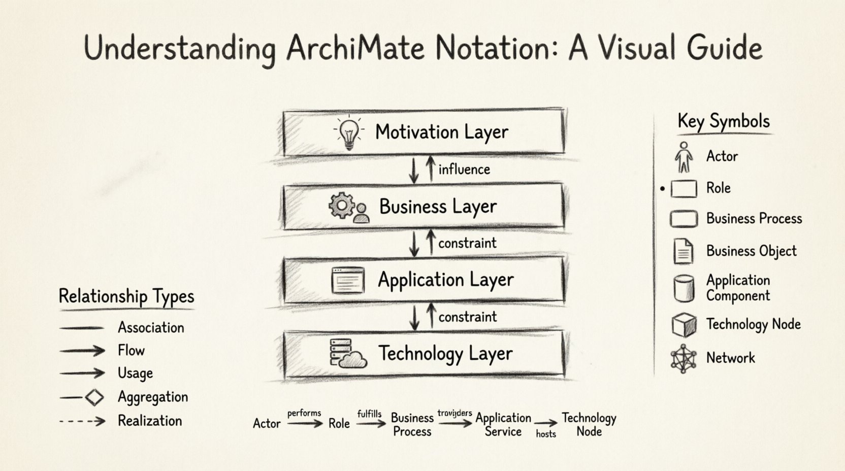
ArchiMate is structured logically to separate concerns. This prevents the diagram from becoming a tangled web of confusion. The notation is organized into horizontal layers and vertical domains. Understanding this grid is the first step to reading any diagram correctly.
🏗️ The Four Main Layers
Think of the layers as a stack of information, moving from abstract ideas to physical reality.
- Motivation Layer: This is the top of the stack. It deals with why the organization is doing something. It includes goals, principles, and drivers. If a stakeholder asks, “Why are we doing this project?”, the answer lives here.
- Business Layer: This layer represents the organization itself. It includes business processes, roles, functions, and products. It is where the actual work happens, regardless of technology.
- Application Layer: This layer covers the software systems that support the business. It includes applications, data objects, and services provided by the software.
- Technology Layer: This is the physical infrastructure. It includes hardware, networks, and system software. It is the foundation that runs the applications.
When reading a diagram, arrows often flow from the top down. This indicates that business goals drive the need for specific applications, which in turn run on specific technology. However, arrows can also flow upwards, showing how technology constraints influence business decisions.
🔗 The Vertical Domains
While layers stack vertically, the diagram is often divided into domains to show different perspectives. The most common domains are:
- Strategy: Focuses on the long-term vision and motivation.
- Business: Focuses on operations, services, and processes.
- Application: Focuses on software capabilities and data.
- Technology: Focuses on infrastructure and security.
🎨 Key Visual Elements Explained
The notation uses specific shapes to represent different concepts. Each shape has a distinct border style, which helps differentiate between the type of element. Below is a breakdown of the most common elements you will encounter.
👥 Business Elements
These elements describe the human and organizational side of the company.
- Actor: Represented by a stick figure icon. This is a person, team, or organization that performs an action. Examples include a “Customer”, “Manager”, or “External Supplier”.
- Role: Represented by a rectangle with a small circle on the left. A role is a cluster of responsibilities assigned to an actor. For example, a “Sales Clerk” is a role played by an actor.
- Business Process: Represented by a rounded rectangle. This is a series of steps performed to achieve a business goal. Examples include “Order Processing” or “Invoice Generation”.
- Business Function: Represented by a rectangle with a small circle on the top right. This is a collection of capabilities required to achieve business goals. It is more static than a process.
- Business Object: Represented by a document shape. This represents data or information used in the business process. Examples include “Customer Record” or “Purchase Order”.
💻 Application Elements
These elements describe the software systems that support the business.
- Application Function: Represented by a rectangle with a small circle on the top left. This is a capability provided by a software application, such as “Login” or “Calculate Tax”.
- Application Service: Represented by a rectangle with a small circle on the right. This is a function offered by an application to the outside world. For example, “Authentication Service”.
- Application Component: Represented by a cylinder shape. This is a physical unit of software, like a specific module or library.
- Data Object: Represented by a document shape with a small folded corner. This is data stored or processed by an application.
⚙️ Technology Elements
These elements describe the hardware and infrastructure.
- Node: Represented by a 3D box shape. This is a computational device or environment. Examples include a “Server”, “Database”, or “Cloud Instance”.
- Device: Represented by a small rectangle. This is a physical device like a “Laptop” or “Mobile Phone”.
- System Software: Represented by a cylinder shape. This includes operating systems or middleware.
- Network: Represented by a mesh shape. This describes the connections between nodes and devices.
🔗 Relationships and Connections
Shapes alone do not tell the full story. The lines connecting them define how elements interact. Understanding these relationships is crucial for grasping the flow of value and data.
📥 Association
An association is a simple link between two elements. It indicates that they are related in some way. For example, an Actor is associated with a Role because the person performs that role. The line has no arrowheads.
🚀 Flow
A flow represents the movement of something, such as data, material, or information. It is usually a directed line with an arrow. For example, a Business Process flows into a Business Object. This shows that the process creates or consumes that object.
🔌 Usage
Usage is a directed relationship indicating that one element uses another. For example, an Application Service uses an Application Function. The arrow points from the user to the provider.
🛠️ Aggregation
Aggregation represents a “part-of” relationship. It indicates that an element is composed of other elements. For example, a Business Process is made up of multiple Business Functions. The line is often solid.
🔗 Realization
Realization indicates that one element implements or realizes another. It often crosses layers. For example, an Application Service realizes a Business Service. The arrow points from the implementation to the specification.
📊 Common Diagram Types
Depending on the audience and the purpose of the analysis, different types of diagrams are created. Each type highlights specific layers and relationships.
| Diagram Type | Focus Area | Typical Audience |
|---|---|---|
| Business Process Diagram | Business Layer | Process Owners, Managers |
| Application Deployment Diagram | Technology & Application Layers | IT Architects, Engineers |
| Strategic Alignment Diagram | Motivation & Business Layers | Executives, Strategists |
| Service-Oriented Architecture Diagram | Application & Business Layers | Developers, Architects |
| System Interaction Diagram | Application & Technology Layers | Technical Teams |
📋 Business Process Diagram
This is the most common diagram for non-technical stakeholders. It focuses entirely on the Business Layer. It shows how work gets done. You will see Actors performing Roles, which trigger Processes that manipulate Business Objects. The goal is to understand the workflow without worrying about the software underneath.
📋 Strategic Alignment Diagram
This diagram connects the high-level goals to the operational activities. It starts in the Motivation Layer with a specific Goal, such as “Increase Customer Satisfaction”. It then traces down to the Business Layer to show which Processes support that goal. This helps stakeholders see if their daily work aligns with company strategy.
📋 Technology Deployment Diagram
This diagram shows where software runs. It maps Application Components to Technology Nodes. For a non-technical stakeholder, this helps understand capacity and infrastructure needs. It answers questions like, “How many servers do we need to handle the new process?”.
👓 Best Practices for Reading Diagrams
Even with the right knowledge, diagrams can be overwhelming. Here are some practical tips for interpreting them effectively.
- Start with the Layer: Identify which layer the diagram focuses on. If it is mostly rectangles with rounded corners, you are likely looking at the Business Layer. If there are cylinders and boxes, you are looking at Technology.
- Follow the Arrows: Arrows indicate directionality. Trace them from the top to understand the flow of requirements. Trace them from the bottom to understand dependencies.
- Look for the Actors: Actors are the starting point of most workflows. Find the stick figures to see who is involved in the process.
- Ignore the Noise: Not every diagram needs to show every relationship. If a diagram is too cluttered, ask for a simplified version that focuses on a specific process.
- Check the Legend: If the shapes are unfamiliar, look for a legend or key. While standard notation exists, some organizations create custom symbols.
⚠️ Common Pitfalls and Misconceptions
When working with these visuals, certain mistakes are common. Being aware of them prevents confusion.
- Mixing Layers Indiscriminately: While relationships can cross layers, a diagram should not be a chaotic mix. A Business Process should not be drawn directly on a Server unless you are showing a specific deployment relationship.
- Confusing Roles with Actors: Remember that an Actor is the “who” and a Role is the “what” they do. A person (Actor) plays a role. They are distinct concepts.
- Overloading the Diagram: Trying to show everything in one view makes the diagram unreadable. It is better to have multiple linked diagrams than one giant map.
- Assuming Technology is Always Top-Down: Sometimes, technology limitations dictate business processes. Do not assume the flow is always from strategy to infrastructure. Business constraints often drive technical choices.
💡 Why Visual Notation Matters
The primary benefit of this notation is communication. In large organizations, departments often speak different languages. The sales team talks about customers and orders. The IT team talks about servers and APIs. This notation provides a common vocabulary.
When a stakeholder points to a diagram, they are not pointing to a specific line of code. They are pointing to a concept. This allows for high-level discussions that are still grounded in reality. It reduces the risk of misinterpretation during project planning.
Furthermore, it helps in impact analysis. If a business goal changes, the diagram shows which processes, applications, and technologies are affected. This allows for better risk management and change planning. You can see the ripple effect before you make a move.
🚀 Moving Forward
Mastering these visuals takes time and practice. The best way to learn is to look at existing diagrams within your organization. Ask the architects or analysts to walk you through them. Don’t be afraid to ask questions about specific shapes or lines.
As you become more familiar with the notation, you will find that you can spot inconsistencies in business processes more easily. You will understand why certain systems are connected and how data flows through the organization. This insight is invaluable for driving digital transformation initiatives.
Remember, the goal is not to become a diagramming expert overnight. The goal is to use these visuals to make better decisions. Use them to clarify requirements, validate strategies, and ensure alignment across the enterprise. With a clear understanding of the notation, you can contribute more effectively to the architectural discussions that shape your organization’s future.
📝 Summary of Key Takeaways
- Layers separate concerns: Keep Business, Application, and Technology distinct.
- Shapes define elements: Rectangles, circles, and cylinders represent different types of objects.
- Lines define relationships: Arrows show flow, usage, and realization.
- Context is key: Always check which layer and domain a diagram focuses on.
- Visuals aid communication: Use them to bridge the gap between business and IT.
By familiarizing yourself with these elements, you empower yourself to navigate complex organizational structures with confidence. The notation is a tool for clarity, and like any tool, its value depends on how well you understand and use it. Keep exploring, keep asking questions, and keep visualizing the path forward.

