Driving traffic to a digital property is only half the battle. The true measure of success lies in how effectively visitors navigate from awareness to action. Many organizations focus heavily on acquisition metrics, overlooking the intricate path users take before converting. This oversight often leads to wasted budget and frustrated users. To bridge this gap, businesses must shift their focus toward journey analysis. By examining the specific steps a customer takes, you can identify bottlenecks and optimize the experience.
This guide explores how to analyze customer journeys to boost conversion rates. We will move beyond simple funnel metrics and look at the behavioral and psychological factors influencing decisions. Through detailed examination of touchpoints and friction, you can create a smoother path for your users.
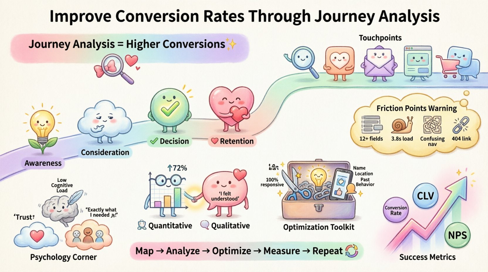
🧭 Understanding the Customer Journey
A customer journey is not a linear line from point A to point B. It is a complex web of interactions, emotions, and decisions. When people visit a website, they bring expectations shaped by previous experiences, brand perception, and immediate needs. Mapping this journey allows you to see the world through their eyes.
- Awareness: The moment a user realizes they have a problem or need.
- Consideration: The phase where they evaluate different solutions.
- Decision: The point where they choose a specific offering.
- Retention: The ongoing relationship after the initial conversion.
Each stage requires different content and support. A user in the awareness stage needs educational material, while a user in the decision stage needs proof of value. Confusing these stages leads to friction. For instance, showing pricing too early in the awareness phase can cause hesitation. Conversely, hiding pricing until the decision phase creates distrust.
🔍 Identifying Key Touchpoints
A touchpoint is any interaction a customer has with your brand. These can occur online, offline, or across devices. In a digital context, these touchpoints form the digital journey. Identifying them is the first step toward analysis.
Common digital touchpoints include:
- Search engine results pages
- Social media posts
- Email newsletters
- Landing pages
- Product detail pages
- Checkout process
- Thank you pages
- Customer support interactions
Each touchpoint must serve a purpose. If a user clicks an ad, the landing page must match the promise made in the ad. A mismatch here causes immediate bounce. Consistency across touchpoints builds trust. This consistency is crucial for maintaining momentum through the funnel.
⚠️ Analyzing Friction Points
Friction refers to any element that slows down or stops a user from completing a desired action. Friction is not always bad; some friction, like asking for an email address, is necessary for lead generation. However, unnecessary friction kills conversion rates. Identifying these points requires looking at data and observing user behavior.
Common sources of friction include:
- Complex Forms: Asking for too much information upfront.
- Slow Load Times: Pages that take more than a few seconds to render.
- Confusing Navigation: Menus that are hard to understand or use.
- Misaligned Messaging: Copy that does not answer the user’s immediate question.
- Technical Errors: Broken links, 404 errors, or broken checkout buttons.
- Mobile Incompatibility: Interfaces that do not scale well on phones.
When friction is high, users abandon their tasks. This abandonment is often silent. You might not see a notification when someone leaves; you only see the drop-off in data. Analyzing where users drop off is critical.
Table: Common Friction Points and Mitigation Strategies
| Friction Point | Impact on Conversion | Mitigation Strategy |
|---|---|---|
| Excessive Form Fields | High Abandonment | Reduce fields to essentials; use progressive profiling. |
| Slow Page Speed | Bounce Rate Increase | Optimize images and code; use caching. |
| Lack of Trust Signals | Low Confidence | Add reviews, security badges, and clear contact info. |
| Unclear Call to Action | Low Click-Through | Use contrasting colors and direct action verbs. |
| Hidden Costs | Cart Abandonment | Display all fees early in the process. |
📊 Data Collection Methods
To analyze the journey effectively, you need accurate data. Relying on a single metric is rarely sufficient. A combination of quantitative and qualitative data provides a complete picture.
Quantitative Data
Quantitative data tells you what is happening. It is numerical and measurable. Key metrics to track include:
- Conversion Rate: The percentage of users who complete a goal.
- Bounce Rate: The percentage of users who leave after viewing one page.
- Average Time on Page: How long users stay engaged.
- Exit Rate: The percentage of exits from a specific page.
- Funnel Drop-off: The specific stage where users leave the process.
This data highlights where problems exist. If the exit rate is high on the pricing page, something is wrong with the value proposition or the layout.
Qualitative Data
Qualitative data explains why it is happening. Numbers show the drop, but they do not explain the reason. Qualitative methods include:
- User Surveys: Asking visitors directly about their experience.
- Session Recordings: Watching videos of user interactions.
- Heatmaps: Visualizing where users click, scroll, and hover.
- Usability Testing: Observing users as they complete tasks.
- Customer Support Logs: Reviewing common complaints and inquiries.
Combining these data sets allows for deeper insights. For example, a heatmap might show that users are clicking a non-clickable element. A session recording might reveal they are confused by the layout. Together, they confirm the need for a design change.
🛠️ Optimization Strategies
Once you have identified friction and collected data, the next step is action. Optimization is an ongoing process, not a one-time fix. It requires testing, learning, and iterating.
1. Simplify the Path
Every extra step adds friction. Review every page and interaction. Can two steps be combined? Can a form be auto-filled? The goal is to reduce cognitive load. Users should not have to think too hard about how to proceed.
- Remove unnecessary fields from forms.
- Use single-column layouts for focus.
- Ensure buttons are large and easy to tap on mobile.
- Minimize the number of clicks to reach the goal.
2. Clarify Value Propositions
Users need to understand the benefit immediately. If they do not see the value, they will not convert. Ensure headlines, subheadings, and images align with the user’s intent.
- Use benefit-driven headlines.
- Showcase social proof near conversion points.
- Explain features in terms of outcomes.
- Provide clear guarantees or warranties.
3. Optimize for Mobile
A significant portion of traffic comes from mobile devices. If the experience is poor on a phone, conversion rates will suffer. Mobile optimization involves more than just shrinking the screen.
- Ensure text is readable without zooming.
- Make navigation thumb-friendly.
- Speed up load times for cellular connections.
- Test forms on various screen sizes.
4. Personalize the Experience
Different users have different needs. Personalization tailors the journey to the individual. This increases relevance and engagement.
- Segment audiences based on behavior or demographics.
- Display dynamic content based on user location.
- Recommend products based on past browsing history.
- Use retargeting to bring back interested users.
📈 Measuring Success
After implementing changes, you must measure the results. This closes the loop and informs future decisions. Success is not just about a spike in traffic; it is about sustainable growth in efficiency.
Key Performance Indicators (KPIs)
Track these metrics to gauge the impact of your journey analysis:
- Conversion Rate: The primary indicator of success.
- Average Order Value: Does the journey encourage higher spending?
- Customer Lifetime Value: Does the journey foster long-term loyalty?
- Task Completion Rate: Are users successfully finishing specific actions?
- Net Promoter Score: How satisfied are users with the experience?
Table: Journey Stages and Corresponding Metrics
| Journey Stage | Primary Metric | Secondary Metric |
|---|---|---|
| Awareness | Click-Through Rate | Bounce Rate |
| Consideration | Time on Site | Pages per Session |
| Decision | Add-to-Cart Rate | Initiated Checkouts |
| Retention | Repeat Purchase Rate | Churn Rate |
🔄 Continuous Improvement
The digital landscape changes constantly. User behaviors shift, technology evolves, and competitors adapt. What works today may not work tomorrow. Therefore, journey analysis must be a continuous practice.
- Regular Audits: Schedule quarterly reviews of the entire journey.
- Feedback Loops: Create channels for users to report issues.
- A/B Testing: Continuously test variations of key pages.
- Competitor Analysis: Observe how others handle similar journeys.
By staying vigilant and responsive, you ensure that your conversion rates remain high. The journey does not end at the sale; it continues through the entire lifecycle of the customer. Every interaction is an opportunity to improve.
🧩 The Psychology Behind the Journey
Understanding the mechanics of the journey is important, but understanding the psychology is vital. Users are not robots; they are influenced by emotions and biases. Recognizing these psychological drivers helps in designing more effective journeys.
Trust and Authority
Users need to trust the entity they are interacting with before they convert. Trust is built over time through consistency, transparency, and reliability. A journey that feels secure reduces anxiety.
- Use professional design standards.
- Display privacy policies clearly.
- Offer secure payment options.
- Ensure contact information is accessible.
Cognitive Load
The human brain has limited capacity for processing information. If a journey is too complex, users will get overwhelmed and leave. Simplification is key to reducing cognitive load.
- Use white space to separate content.
- Limit choices to avoid decision paralysis.
- Use familiar patterns and conventions.
- Break complex tasks into smaller steps.
Social Proof
People look to others to determine the right behavior. Seeing that others have succeeded reduces the perceived risk of trying something new.
- Showcase customer testimonials.
- Display user-generated content.
- Highlight the number of users or sales.
- Use case studies to demonstrate value.
🎯 Final Thoughts on Journey Analysis
Improving conversion rates is not about tricking users into clicking. It is about removing obstacles so they can make decisions easily. Journey analysis provides the map needed to find these obstacles. By focusing on the user’s experience rather than just the output, you create a better environment for business growth.
Start by mapping your current journey. Identify where users struggle. Collect data to understand why. Implement changes to fix the issues. Measure the results. Repeat the process. This cycle creates a resilient, high-performing digital presence.
Remember that every optimization is a step toward a better experience. The goal is to make the journey as seamless as possible. When users feel supported and understood, they are more likely to convert. This approach builds long-term value for both the customer and the business.
Begin your analysis today. Look at the data, listen to the feedback, and refine the path. The potential for improvement is always there if you know where to look.

