Creating a customer journey map is often mistaken for simply drawing a timeline of interactions. In reality, the true value lies in how that information is communicated to decision-makers. A map that is visually dense, text-heavy, or abstract often fails to drive action. When stakeholders cannot immediately grasp the narrative, the insights remain theoretical rather than operational. This guide focuses on the specific mechanics of designing visuals that translate complex data into actionable strategy.
The goal is clarity. A well-designed visual representation reduces cognitive load, allowing leadership teams to identify friction points, emotional highs, and missed opportunities without wading through spreadsheets. By focusing on structure, hierarchy, and color theory, we can create artifacts that serve as a shared language across departments.
🎯 The Strategic Value of Visual Clarity
Stakeholders range from executive leadership to operational managers. Each group requires different levels of detail. Executives often need the high-level narrative to understand ROI and brand sentiment. Managers need specific touchpoints to allocate resources and adjust workflows. If the visual design does not distinguish between these layers, the map becomes useless to one or both groups.
Effective visuals serve three primary functions:
- Alignment: They create a single source of truth regarding how the customer experiences the brand.
- Identification: They highlight specific moments where the experience breaks down or exceeds expectations.
- Communication: They bridge the gap between qualitative research and quantitative business metrics.
When a journey map is presented in a cluttered format, stakeholders may default to their own assumptions rather than the data. Clear design forces the viewer to engage with the actual journey steps, reducing the risk of bias in decision-making.
👥 Understanding Stakeholder Priorities
Before drawing a single line, it is essential to understand who will be viewing the map. A visual designed for a product team will differ significantly from one designed for a marketing director. The following table outlines the typical priorities across common stakeholder roles.
| Stakeholder Role | Primary Focus | Key Visual Needs |
|---|---|---|
| Executive Leadership | Revenue, Retention, Brand Health | High-level summary, emotional curve, major friction points |
| Product Managers | Feature Adoption, Usability | Feature touchpoints, error states, onboarding steps |
| Customer Support | Resolution Time, Contact Volume | Support channels, escalation paths, pain points |
| Marketing Team | Awareness, Conversion, Messaging | Acquisition channels, messaging consistency, campaign integration |
| Operations Team | Efficiency, Logistics, Fulfillment | Fulfillment steps, delivery timelines, internal handoffs |
Designing a single visual to satisfy all these groups is difficult. A better approach is to create a master map with layered detail. The base layer should address the Executive Leadership needs, while drill-down sections or appendices can provide the granularity required by Product or Operations teams.
🧩 Anatomy of a Clear Journey Map
A robust visual structure relies on consistent components. Without standardization, every map looks different, making it hard to compare experiences over time. The following elements should be present in every design, arranged logically.
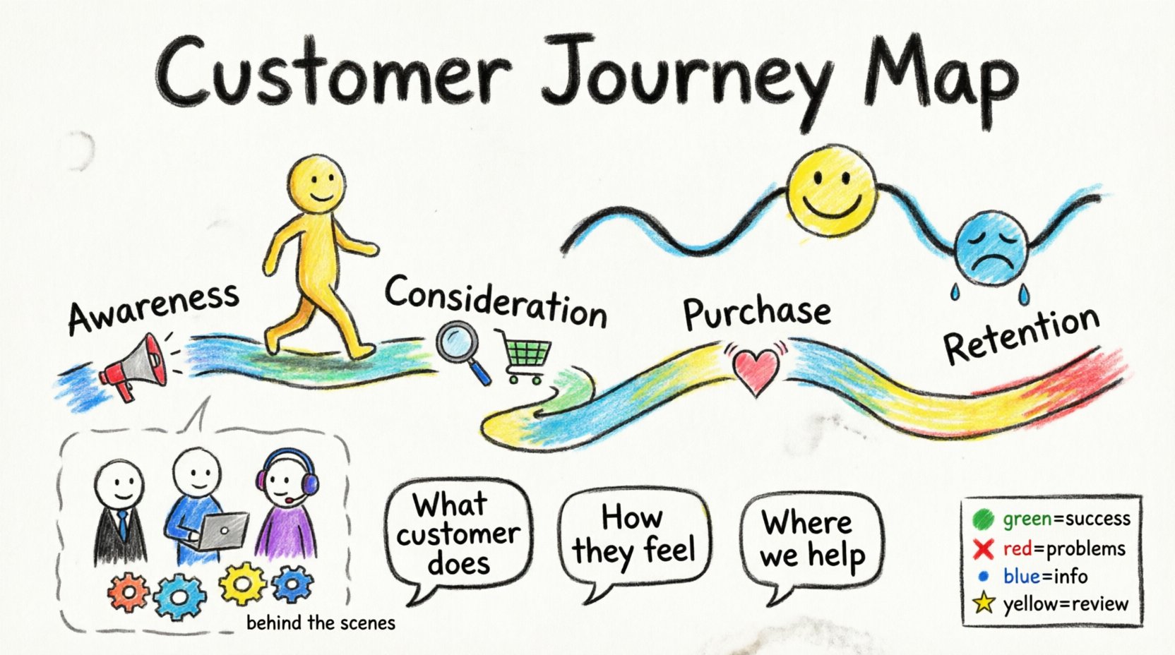
1. Phases of the Journey
The horizontal axis typically represents time or progression. Dividing the journey into phases (e.g., Awareness, Consideration, Purchase, Retention) provides a logical framework. Each phase should be distinct, perhaps separated by color blocks or vertical dividers, to help the eye scan the progression.
2. Customer Actions
What does the user actually do? This is the backbone of the map. Actions should be written in the active voice. Instead of “User is logged in,” use “User Logs In.” Keep these concise. Long descriptions break the flow.
3. Touchpoints
Where does the interaction happen? This could be a website, a physical store, a phone call, or an email. Visual cues like icons or distinct badges help distinguish between digital and physical channels without needing extra text.
4. Emotional Curve
How does the user feel? A line graph running above or below the journey timeline is the standard convention. It visualizes satisfaction levels. High points indicate moments of delight; low points indicate frustration. This curve is often the most critical part for stakeholders to understand the emotional impact of the process.
5. Pain Points and Opportunities
Directly annotate the map where things go wrong. Use a specific shape or color to mark these. Annotate them clearly. Do not hide the problems. The opportunity to fix a pain point should be visually linked to the specific action causing the issue.
6. Behind the Scenes
What is happening internally to support the customer? This section is often overlooked but vital for Operations. It shows the internal systems, approvals, or manual tasks required to fulfill the customer action. This reveals inefficiencies in the backend that affect the frontend experience.
🎨 Visual Design Principles for Maps
Good data visualization principles apply directly to journey mapping. The goal is to guide the eye naturally from left to right, following the narrative flow. Avoid decorative elements that do not serve a functional purpose.
Hierarchy and Readability
Size matters. The most important information should be the largest. The phase names should be prominent. The emotional curve should be bold. Supporting details like specific touchpoints can be smaller. If everything is the same size, nothing stands out, and the viewer gets overwhelmed.
Color Usage
Color should convey meaning, not just decoration. Use a consistent palette throughout the document. For example:
- Green: Success, resolution, positive sentiment.
- Red: Errors, drop-offs, negative sentiment.
- Blue: Informational, standard process steps.
- Yellow/Orange: Warnings, potential issues, areas for review.
Do not use more than four to five distinct colors for the primary data. Too many colors create visual noise. Ensure the contrast is high enough for accessibility. Stakeholders with visual impairments must be able to distinguish the critical elements.
White Space
Clutter is the enemy of clarity. Leave breathing room between elements. If the map is too dense, stakeholders will not read it. Group related items together but separate distinct phases clearly. Use margins to define the boundaries of the journey.
🛠️ Step-by-Step Design Process
Building the visual is a methodical process. Rushing this step leads to inaccuracies that undermine the entire exercise. Follow this workflow to ensure quality.
Step 1: Data Synthesis
Gather all qualitative and quantitative data first. Interview data, analytics, support tickets, and survey results. Do not start drawing until the narrative is clear. If the data is conflicting, resolve the discrepancies before visualizing.
Step 2: Define the Scope
Decide the start and end points of the journey. Is it the first time they see an ad, or the first time they open the app? Is it the end of the subscription or the renewal? A clear scope prevents scope creep during the design phase.
Step 3: Draft the Skeleton
Create a wireframe using basic shapes. Place the phases, the emotional line, and the main actions. At this stage, ignore colors and icons. Focus on the layout and flow. Ensure the aspect ratio fits the presentation medium (slide deck, print handout, or digital dashboard).
Step 4: Apply Content
Fill in the details. Add the specific touchpoints and backend processes. Ensure the text is concise. Use bullet points within the map cells if the descriptions are long, rather than long paragraphs.
Step 5: Validate with Stakeholders
Before finalizing, show the draft to the people who will use it. Ask them if the emotional curve matches their experience. Ask if the backend processes are accurate. Adjust based on feedback. This step ensures the map is not just a pretty picture but a functional tool.
⚠️ Common Mistakes to Avoid
Even experienced designers fall into traps that reduce the effectiveness of the map. Being aware of these pitfalls helps maintain integrity.
- Assuming a Single Journey: Different customer segments have different journeys. Do not try to force a “perfect” user into a generic map. Create variations for different personas if the paths diverge significantly.
- Ignoring the Emotional Curve: Focusing only on the steps misses the feeling. A user might click through all the steps but feel frustrated the entire time. The emotional data is often more predictive of churn than the action data.
- Overloading with Data: Including every possible metric makes the map unreadable. Select the key metrics that drive the story. Save the granular data for an appendix or a separate dashboard.
- Lack of Context: A map without a date or version number becomes outdated quickly. Always include metadata indicating when the map was created and what data it is based on.
- Using Jargon: Avoid internal acronyms that external stakeholders or new employees might not understand. Write for the audience, not for the team.
📊 Ensuring Data Integrity vs. Visual Appeal
There is a tension between making the map look good and making sure the data is accurate. It is better to have a simple, accurate map than a beautiful, inaccurate one. Visual polish should never obscure the truth.
If a stakeholder asks why a specific number is highlighted, you must be able to point to the source. Maintain a legend that explains every symbol used. If you use a specific icon for a pain point, ensure it is defined clearly.
Regularly audit the map. Customer behavior changes. Technology changes. A map created six months ago may no longer reflect the current reality. Schedule reviews to update the visuals and the underlying data.
🔄 Iteration and Maintenance
A journey map is a living document, not a static artifact. Once designed, it should be integrated into regular business meetings. Use it to track progress on initiatives. When a change is made to the product, update the map to reflect that change.
Version control is essential. If you release a new version of the map, label it clearly (e.g., v1.0, v1.1). This allows the team to track how the understanding of the customer has evolved over time.
🔍 Measuring the Success of Your Visuals
How do you know if the visual design worked? Look for behavioral changes in the meetings where the map is presented.
- Discussion Quality: Are the conversations focused on the customer experience, or do they drift to internal politics?
- Decision Speed: Does the map help the team reach a decision faster by highlighting the bottleneck?
- Adoption: Do other teams reference the map in their own planning documents?
- Clarity: Ask stakeholders to explain the journey back to you. If they can describe the pain points and opportunities without referring to the text, the visuals succeeded.
🏁 Final Thoughts on Communication
The act of designing a journey map is an exercise in empathy. It forces the team to step outside their internal processes and see the world through the eyes of the customer. When the visual design is clear, that empathy translates into action. Stakeholders stop seeing problems as abstract concepts and start seeing them as specific moments in a timeline that can be improved.
By prioritizing structure, color psychology, and stakeholder needs, you create a tool that aligns the organization. The map becomes the reference point for strategy. It ensures that every department is working toward the same definition of a positive customer experience.
Remember that the best design is invisible. The viewer should not be thinking about how the map is built; they should be thinking about the customer journey itself. Focus on removing barriers to understanding. Remove unnecessary text. Simplify the icons. Ensure the emotional curve is readable. When these elements come together, the visual serves its true purpose: driving better business outcomes through better customer understanding.

