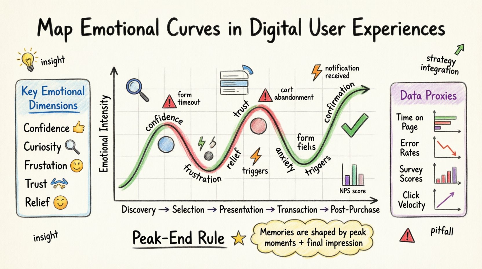
Understanding how users feel is just as critical as understanding what they do. In the landscape of Customer Journey Mapping, behavioral data tells you where a user went, but emotional data tells you why they stopped, turned back, or continued forward. Creating a map of emotional curves in digital user experiences allows product teams to visualize the psychological journey alongside the functional one. This approach shifts the focus from mere transaction completion to genuine human connection.
When we talk about mapping emotional curves, we are discussing the fluctuation of sentiment over time. It is not enough to know a user completed a purchase. We must know if they felt relieved, frustrated, excited, or anxious during that process. This guide details the methodology for integrating emotional analysis into your digital strategy without relying on external tools or hype.
Why Traditional Maps Miss the Mark 😐
Standard journey maps often rely on linear processes: sign-up, browse, add to cart, checkout. This structure assumes rational decision-making. However, human behavior is rarely purely rational. Stress, fatigue, excitement, and confusion play significant roles in digital interactions.
- Linear vs. Cyclical: Traditional maps suggest a straight line. Emotional curves acknowledge that user sentiment often oscillates.
- Behavioral vs. Psychological: Clicks and scrolls are visible. Frustration and delight are internal states that require inference.
- Static vs. Dynamic: A static map does not capture how emotions change based on context, time of day, or device usage.
By ignoring the emotional component, organizations risk optimizing for efficiency while damaging satisfaction. A user might complete a task quickly, but if the process caused significant anxiety, they are unlikely to return.
Understanding the Emotional Landscape 🌊
Before mapping begins, it is necessary to define the emotional states relevant to your digital environment. Emotions in UX are not binary (happy/sad). They exist on a spectrum of intensity and valence.
Key Emotional Dimensions
- Confidence: Does the user feel secure in their actions?
- Curiosity: Does the interface encourage exploration?
- Frustration: Where do barriers cause negative sentiment?
- Trust: Does the design validate the user’s intent?
- Relief: When does the burden of a task lift?
Mapping these states requires a shift in perspective. You are no longer looking at a funnel; you are looking at a topography. Peaks represent high satisfaction or high stress. Valleys represent satisfaction or relief.
The Methodology of Emotional Mapping 🧭
Constructing an emotional curve involves gathering qualitative and quantitative data. This process should be systematic to ensure accuracy. Below is the step-by-step approach to building these curves.
Step 1: Define the Journey Stages
Break down the digital experience into distinct phases. For an e-commerce context, this might look like:
- Discovery
- Selection
- Presentation
- Transaction
- Post-Purchase Support
Each stage represents a potential shift in emotional state. Do not assume emotions remain constant throughout a single phase.
Step 2: Identify Emotional Triggers
Every interaction has a trigger. A trigger can be positive or negative. Identifying these allows you to predict emotional shifts.
- Visual Triggers: Color schemes, loading animations, error messages.
- Functional Triggers: Search speed, form complexity, navigation clarity.
- Contextual Triggers: Device type, network speed, time of day.
Step 3: Collect Sentiment Data
Data collection must happen at multiple points. Relying solely on post-task surveys is insufficient. You need real-time and retrospective data.
- Direct Feedback: Surveys asking about specific feelings at specific moments.
- Behavioral Proxy: Hesitation time, repeated clicks, rapid form completion (which may indicate rushing).
- Qualitative Research: Interviews where users describe their mental state during the journey.
Touchpoints and Triggers 🎯
Not all touchpoints carry the same emotional weight. Some are critical moments of truth. Mapping these requires a detailed breakdown of where the user interacts with the system.
Consider the following common touchpoints and their typical emotional profiles:
- Entry Point: Often characterized by curiosity or skepticism. The design must immediately establish credibility.
- Search Function: A high-stakes moment. Failure here leads to immediate frustration.
- Form Filling: A high-friction area. Users often feel burdened here.
- Confirmation: A peak of relief or satisfaction. This is where trust is solidified.
By analyzing these specific points, you can pinpoint exactly where the emotional curve dips or rises.
Quantifying the Intangible 📏
Emotions are subjective, but they can be measured through proxies. While you cannot measure “joy” directly, you can measure indicators that correlate with it.
Data Sources for Emotional Analysis
| Data Type | What It Measures | Emotional Indicator |
|---|---|---|
| Time on Page | Engagement Duration | Confusion (Too High) vs. Interest (Balanced) |
| Error Rates | System Failures | Frustration / Anxiety |
| Survey Scores | Explicit Sentiment | Satisfaction / Disappointment |
| Click Velocity | Interaction Speed | Urgency / Hesitation |
Using this table helps structure your data collection. It ensures you are looking for specific signals that correspond to specific emotional states.
Integrating Findings into Product Strategy 📈
Mapping the curve is only the first step. The value lies in how you act on the insights. If you find a dip in confidence at the checkout phase, the design must be adjusted to restore trust.
- Remove Friction: If frustration is high due to complex forms, simplify input fields.
- Provide Reassurance: If anxiety is high regarding security, display trust badges or clear privacy policies.
- Celebrate Success: If relief is low after completion, enhance the confirmation message to reinforce positive sentiment.
This integration turns emotional data into a roadmap for product development. It moves the conversation from “what features do we build?” to “how do we make users feel while using them?”.
Common Pitfalls 🚧
Even with a structured approach, there are risks to emotional mapping. Awareness of these pitfalls ensures the integrity of your analysis.
- Assumption Bias: Do not assume you know how users feel without asking them. Personal bias can distort the curve.
- Over-Generalization: Different user segments experience emotions differently. A curve for a novice user differs from an expert user.
- Ignoring Context: A user on a mobile device during a commute may feel different than a user on a desktop at home. Context matters.
- Short-Term Focus: Emotional curves can shift over time. A new feature might delight initially but cause frustration later as novelty fades.
Case Scenarios in Digital Experiences 💡
To illustrate how this works in practice, consider two distinct scenarios where emotional mapping reveals different needs.
Scenario A: Financial Application
In a banking app, the transaction phase is critical. The emotional curve typically shows a sharp rise in anxiety during the confirmation step.
- Observation: Users hesitate before clicking “Send Money”.
- Emotional State: Fear of loss, uncertainty.
- Action: Add a clear summary review screen with a countdown timer to reduce impulsivity and increase confidence.
Scenario B: Social Platform
In a social platform, the content consumption phase drives engagement. The emotional curve here is about excitement and validation.
- Observation: Engagement drops after posting content.
- Emotional State: Anticipation turning into anxiety if no feedback arrives.
- Action: Provide immediate, positive feedback mechanisms to sustain the positive emotional peak.
These scenarios demonstrate that the emotional requirements vary by industry and function. The mapping process must be tailored to the specific digital environment.
Long-Term Strategy and Evolution 🚀
Emotional mapping is not a one-time project. It is an ongoing discipline. As products evolve, so do user expectations. What delighted users five years ago might now be standard.
- Regular Audits: Schedule quarterly reviews of the emotional curve to detect drift.
- Continuous Testing: Use A/B testing to validate changes in emotional response. Does a new design actually reduce anxiety?
- Feedback Loops: Ensure user feedback mechanisms are always active. Users should be able to report feelings in real-time.
Building a culture that values emotional data requires leadership buy-in. When executives understand that emotional health correlates with retention, the strategy gains traction.
The Psychology Behind the Curve 🧠
Understanding the underlying psychology helps interpret the data. The “Peak-End Rule” is particularly relevant here. Users remember the most intense point of an experience and the end point. They do not remember the average.
- Peak Moments: These are the highs and lows. Optimizing for a high peak can outweigh a long period of mediocrity.
- End Moments: The final impression sets the tone for future interactions. Ensure the exit path is smooth and positive.
By focusing on these psychological anchors, you can shape the memory of the experience, which is ultimately what drives loyalty.
Measuring Impact Over Time ⏳
How do you know if your emotional mapping is working? You need to link sentiment to business outcomes. This connection validates the effort.
- Retention Rates: Do users who report positive emotions stay longer?
- Support Tickets: Do negative emotional spikes correlate with increased support volume?
- Referrals: Do happy users refer others more frequently?
Tracking these metrics over time provides a clear picture of the return on investment for emotional design. It moves the conversation from “nice to have” to “business critical”.
Building Empathy into the Workflow 🤝
Finally, the team building the product must understand these curves. If the designers and developers do not empathize with the user, the data on paper will not translate to reality.
- Shared Visits: Have the team review the emotional journey maps together.
- User Interviews: Let the team hear directly from users about their feelings.
- Visualizations: Use the curve charts in sprint planning to remind the team of the human element.
When empathy is embedded in the workflow, the emotional curve becomes a natural part of decision-making rather than an afterthought.

